In an age where information, misinformation and disinformation abounds I was reminded of my past students regular issues in interpreting graphs.
It occurred to me how the use [or misuse of] the vertical axis in and the careful choice of the horizontal axis can serve to better explain or more completely obscure the real situation.
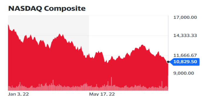
Take the graph of the Nasdaq Composite.
The scale starts at 8000 not zero making the decline look even more spectacular [not thats its good even then].
Anyone looking at that graph might conclude that it's the 1930 stock market crash again.
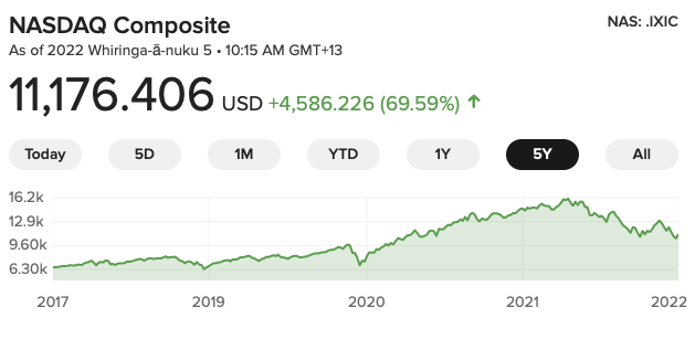
Compare that same index over a longer period and the conclusion might be a little more measured.
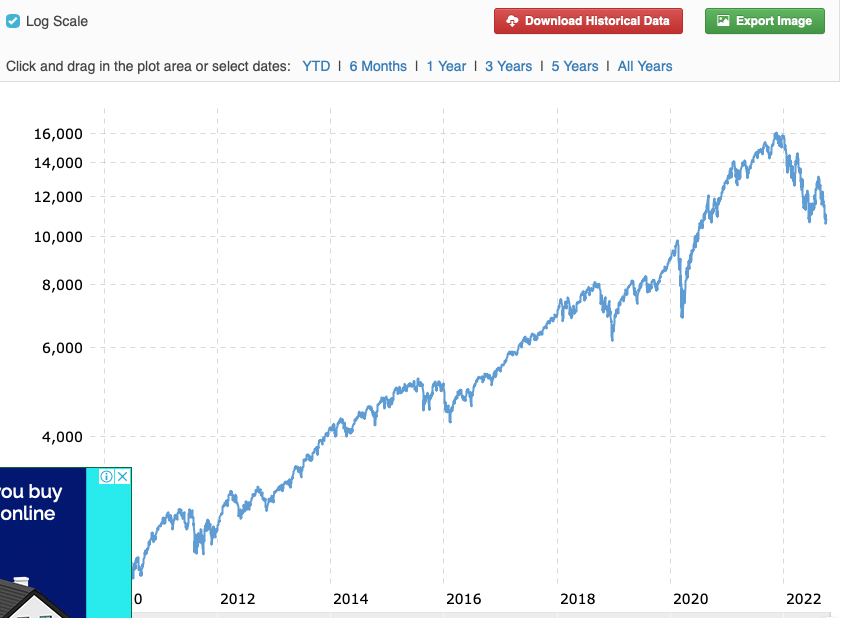
Compare that same index over an even longer time period and you might even be quite sanguine about the latest movment.